
Melosa

Overview
MELOSA is a Buenos Aires-based brand specialized in one thing: quesillo.
A simple dessert became the starting point for building an entire brand universe around flavor, indulgence and personality.
Rather than presenting quesillo as something traditional or expected, MELOSA turns it into a playful experience, colorful, expressive and impossible to ignore.
The Challenge
Dessert brands often rely on the same visual language, soft colors, delicate typography and familiar ideas of sweetness. Melosa needed to escape those conventions. The challenge was to create a brand that could make a very specific product feel exciting, memorable and ownable, while communicating what really matters when you try it: the pleasure of the flavor itself.
The Solution
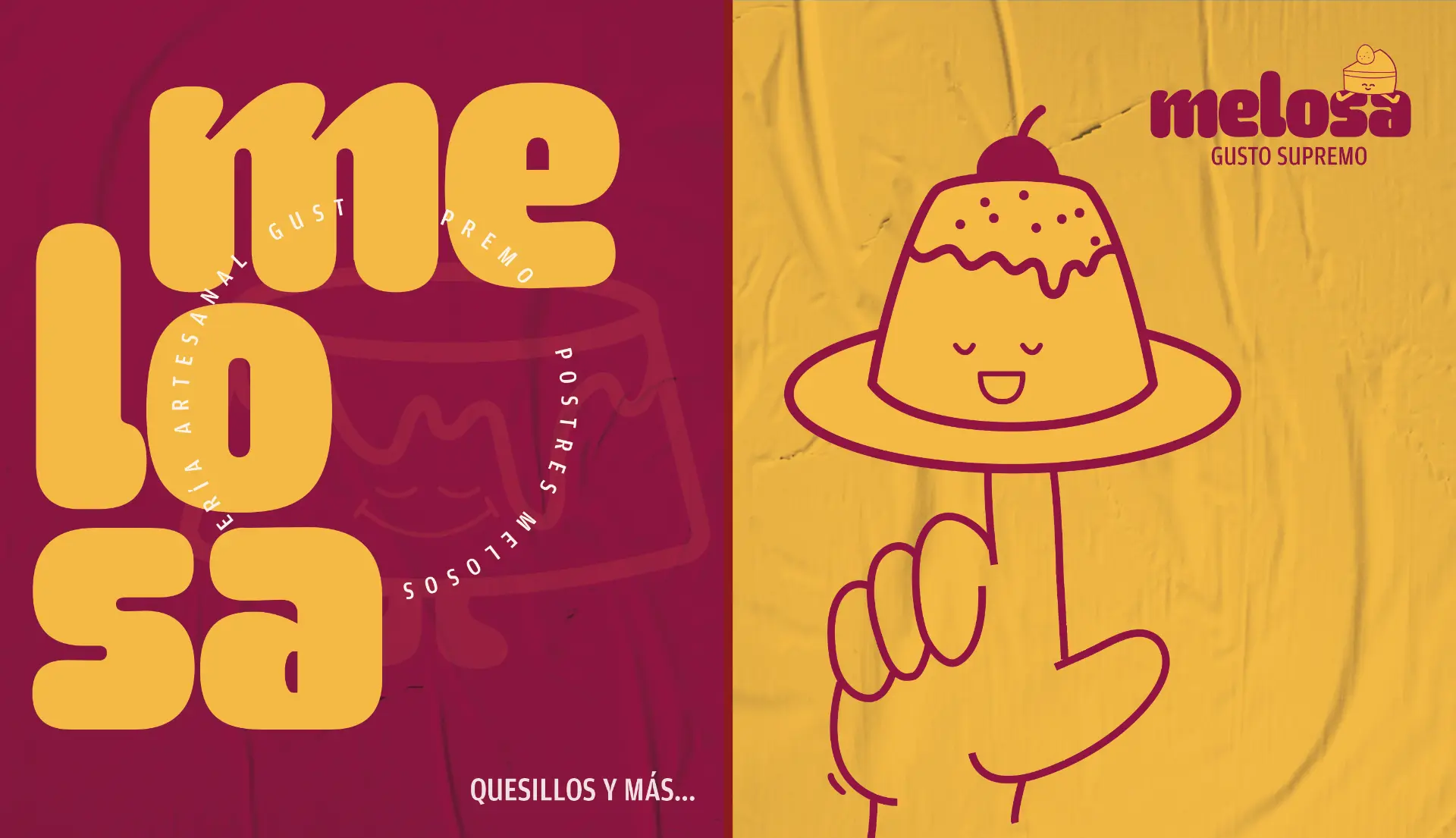
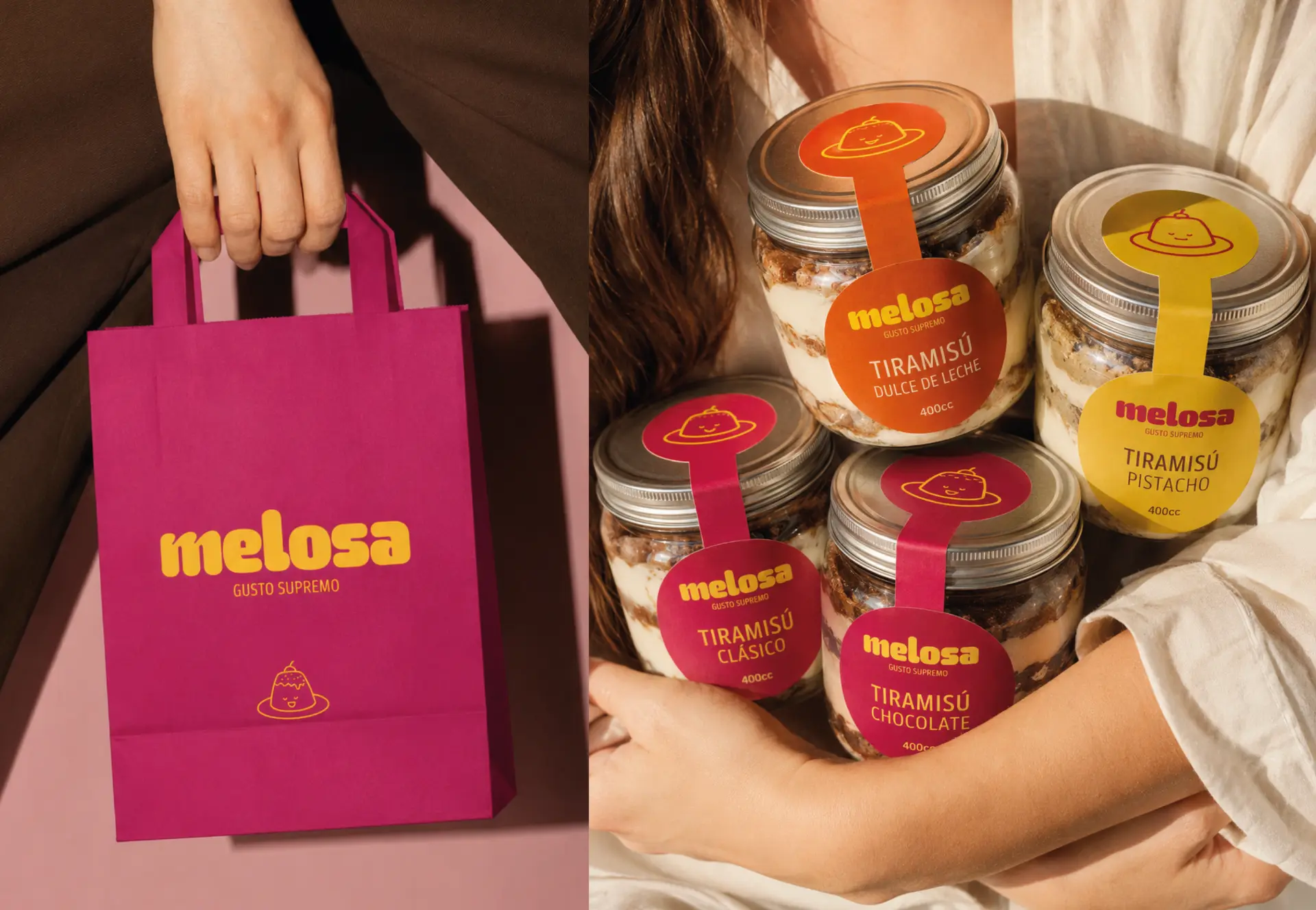
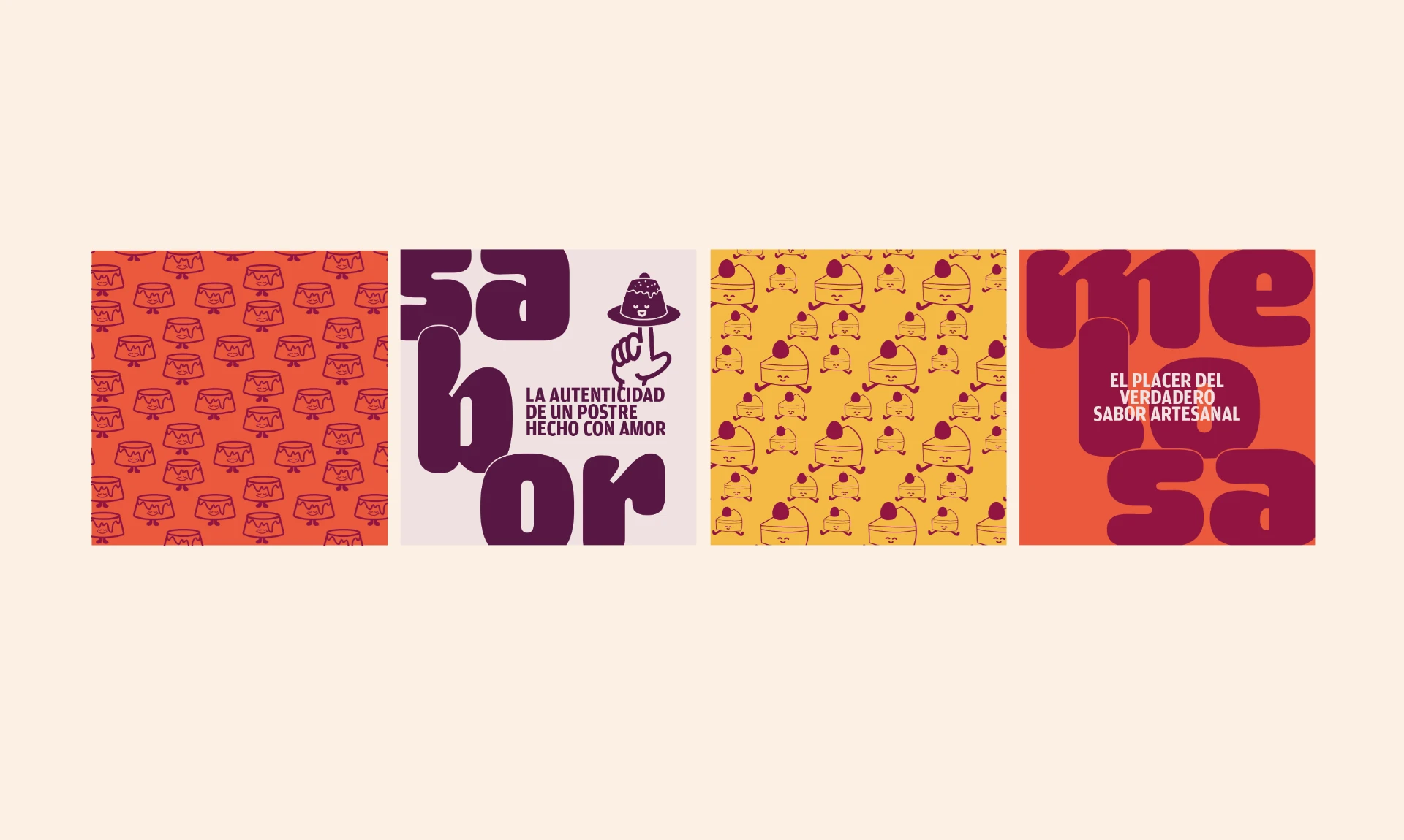
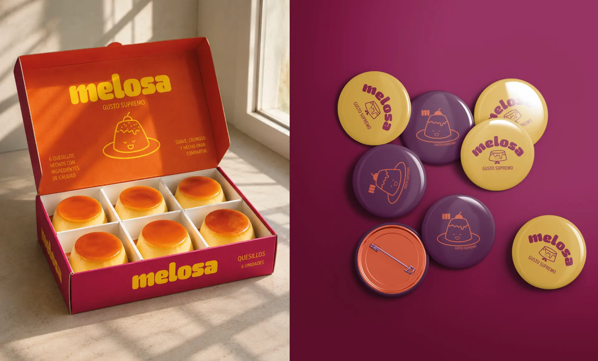
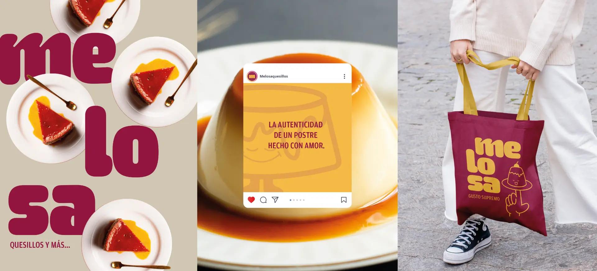
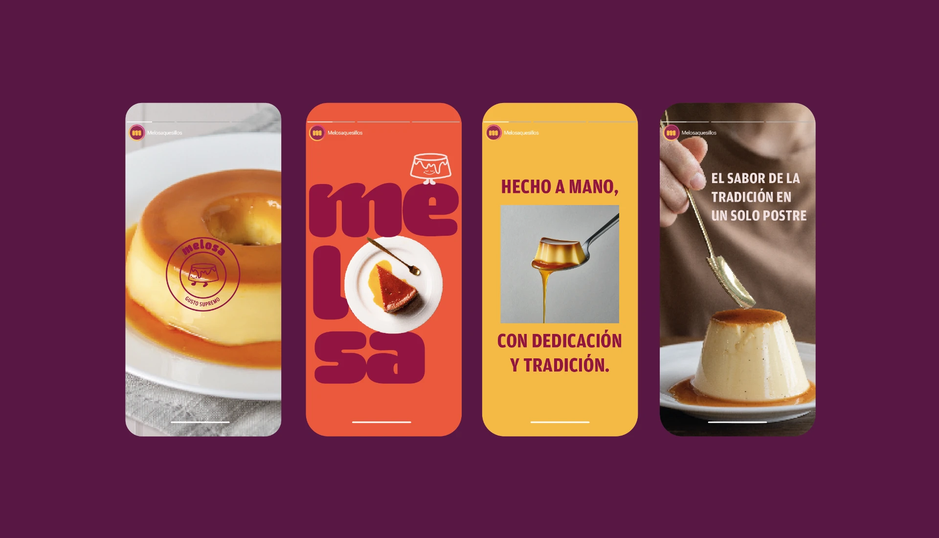
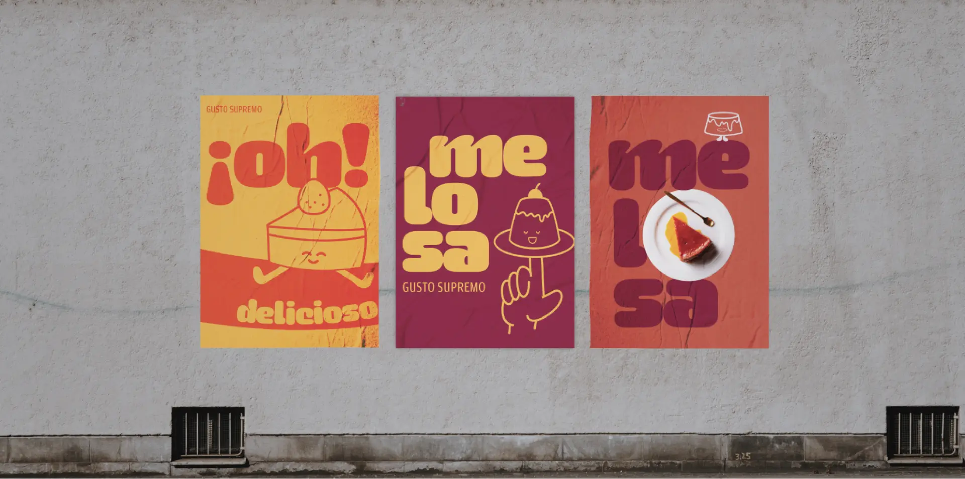
We turned flavor into character. A bold typographic identity, vibrant color combinations and a family of playful illustrated characters gave Melosa a visual language as expressive as the product itself. The quesillo became more than something shown in photography, it became a character, a graphic element and the protagonist of the brand's storytelling. The result is a brand that doesn't simply sell quesillo. It makes you crave the whole Melosa experience.
Next case
Identia