
Aysen
Overview
AYSEN Travel Lab began with two travelers. A Venezuelan and a Frenchman brought together by their love for hiking, remote landscapes and the kind of experiences that make you understand a place beyond simply visiting it. After years of exploring as travelers themselves, they decided to create the kind of agency they had always looked for: one that approaches travel with curiosity, local knowledge and intention. That idea became Travel Lab, a laboratory for discovering, testing and designing experiences in one of Chile's most extraordinary regions, Aysen.
The Challenge
Aysen already has nature as its greatest attraction. The challenge was not to make the destination look beautiful, but to create a travel brand with enough character to stand apart in a category where mountains, landscapes and adventure imagery often make every operator look similar. The brand needed to communicate exploration and expertise without feeling overly technical, touristic or extreme. Most importantly, it had to position AYSEN not simply as a company that sells excursions, but as a team that understands the territory through the eyes of travelers themselves.
The Solution
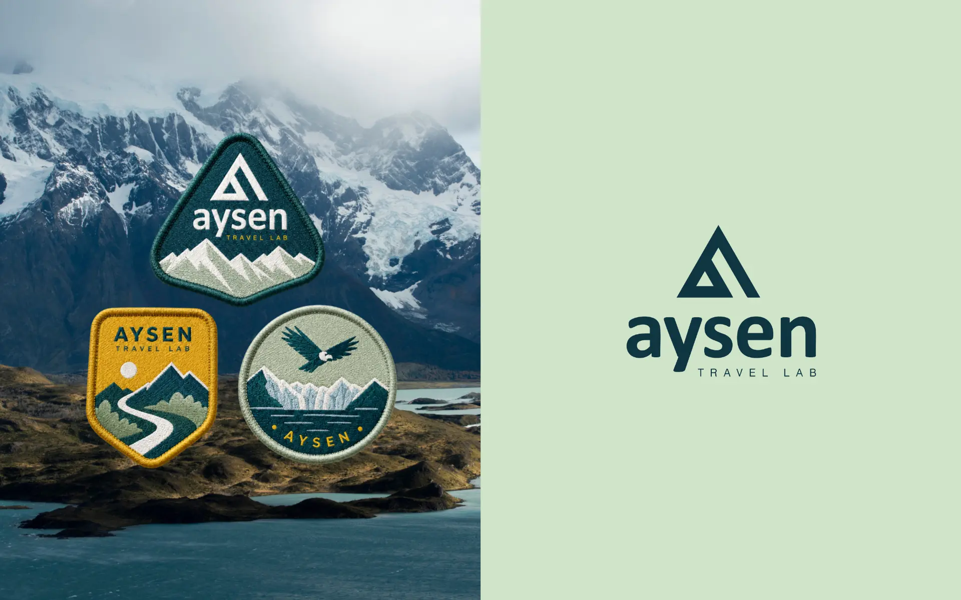
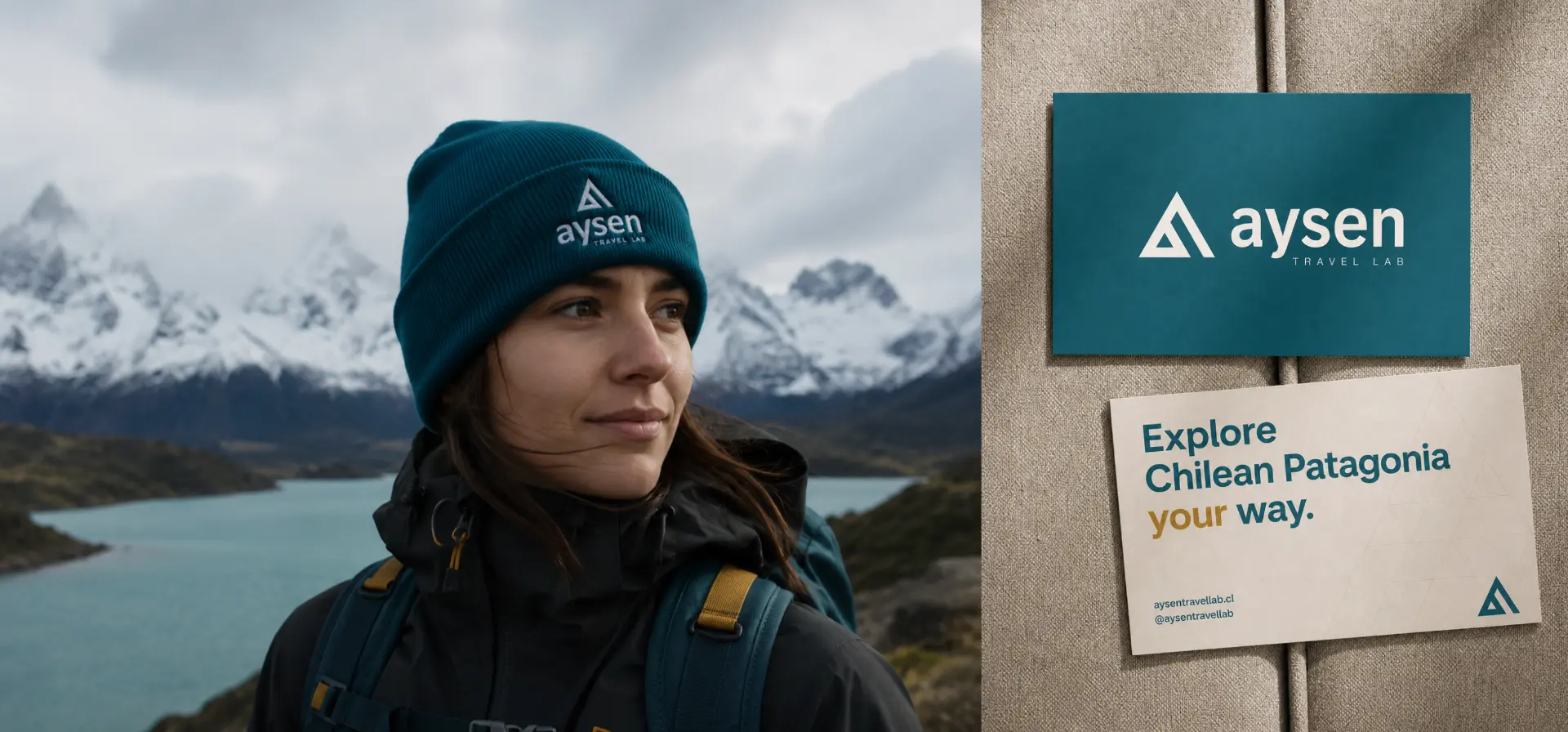
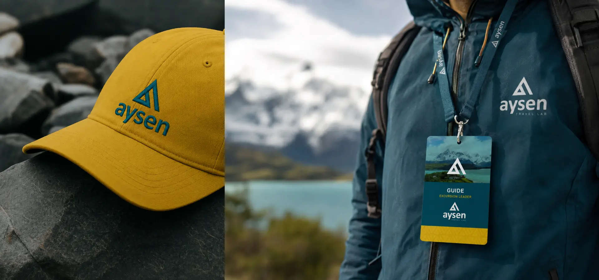
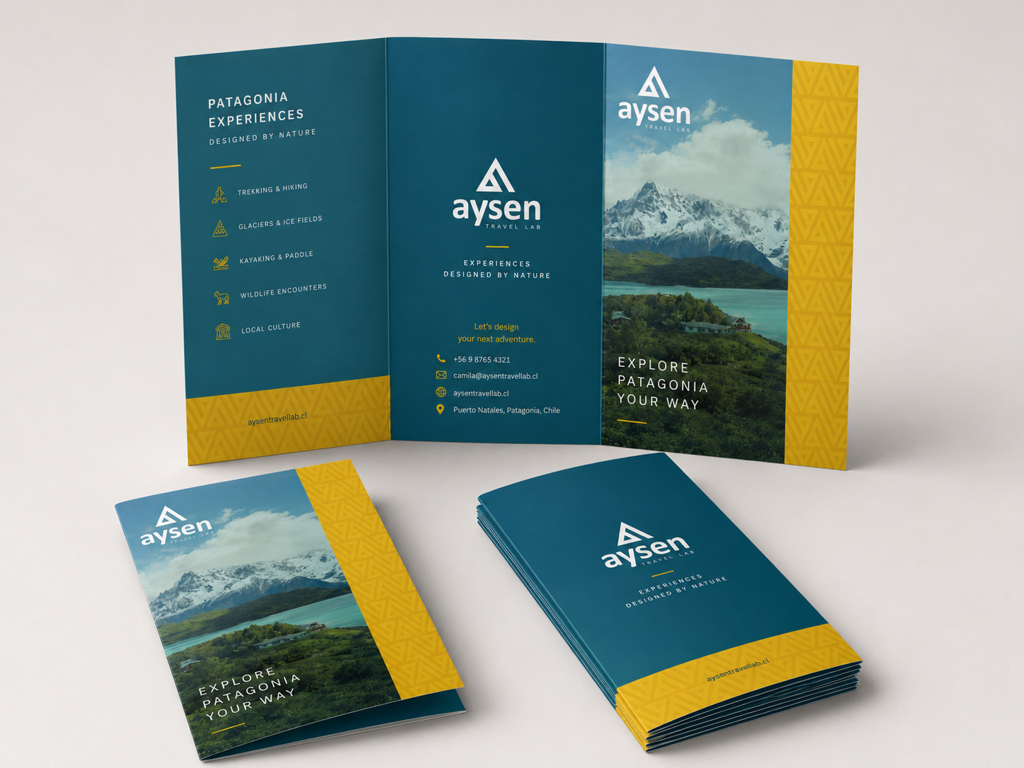
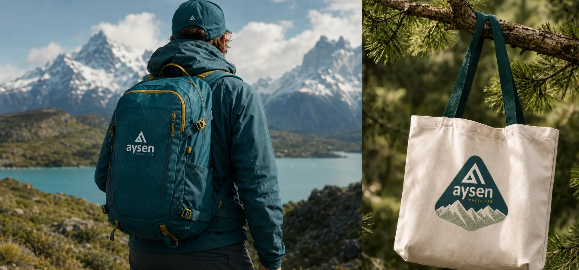
We built the identity around the idea of exploration with purpose. The symbol abstracts the geometry of the mountains into a simple, recognizable mark, connecting the brand directly to the landscape without relying on a literal illustration. A clean typographic system and restrained visual language balance the wildness of Patagonia with a more contemporary and considered approach to travel. The “Travel Lab” concept extends that philosophy beyond the logo: every experience is approached as something to explore, curate and refine.
Next case
Melosa